Monday, 19 December 2011

EVALUATION QUESTION 6; What have you learnt about technologies from the process of constructing this product?


While completing the whole of the task i personally used various softwares ranging from the internet to research other particular music magazines, blogger to keep a record of my progress throughout the year and to show how i'm developing, photoshop to actually design the front cover, contents page and double page spread of my magazine, youtube to give me ideas on how to present an interview for my double page spread, these show all the digital and physical equipment i used throughout the whole of this particular task. I used various equipment like a HD camera, and a windows computer which included a keyboard, monitor and mouse to allow me to actually make my magazine, along with various softwares but mainly photoshop which allowed me to create and edit my magazine and photos for my magazine. If the computers didn't contain this software we would be troubled with various problems like if we didn't have google we couldn't research other similar music magazines to get ideas, or if we didn't have blogger, we couldn't keep a record of our progess and how must be have improved as the year has gone on, and mainly photoshop we wouldn't be able to actually create a decent looking magazine to fit into the media industry. If we didn't have a HD camera our photos would be of a poorer quality rather than a more advanced image quality to make the magazine more effective to the target audience.
EVALUATION QUESTION 7 Looking back at your preliminary task (the school/college magazine task/short continuity film sequence), what do you feel you have learnt in the progression from that to your full product?

From my preliminary task to my full I can see many improvements and changes made. Firstly the layout has
improvement dramatically as the writing was the main concept on my preliminary task however on my final music magazine the image catches the audience eye and intrigues the target audience to look at the rest of the page. Similarally the masthead and key feature being 'Rihanna' and 'Children in need' are in a similar place. most of them vary and are different as there is only about two main fonts that look professional in my final music magazine that I personally look more professional. By using photoshop I've learned that it can help make my full product more professional.  I had to learn all the tools and ways of photoshop and this when comparing my new to old. On my full version I used a 3 colours yellow , blue and black and this looked more professional than my preliminary where I used any colours. I've learnt that magazines have a more professional look when there is only a few colours on them. The main image takes up the full page and this looks much better like this than  my previous image where it only filled a little of the page. Overall I've learnt that the different fonts, colours and layout all combine together to make the best possible product.

Thursday, 15 December 2011

Evaluation 3


EVALUATION QUESTION 3 
What kind of media institution might distribute your media product and why?

Q magazine is a music magazine that features various genres in it. The magazine relates to mine because like my magazine has a similar pose where the model looks mysterious. The Q title also  was incorparated into my magazine with the letter T that I used on my contents page.  The publisher of Q magazine is Bauer Media Brands who publish a range of magazines such as TVChoice and Total TVGuide, Take a Break and that's life! We can see the difference in the type of magazine that they are. Take a break is targeted for the older population which features mostly true life stories and puzzles.  With these types of magazines there are a range of ways to view them in nowadays.  The most common being the internet . Its free and fast way to view the magazine.Another newly invented way of  looking at magazines are the apps that you can get  on a phone.  Q magazine would best fit the younger target audience and the models used would be young and good looking. The take a break magazine http://www.takeabreak.co.uk/ would commonly be suited to having an older model. The magazines both have subscription and these are a way of making the magazine cheaper to the public.


Wednesday, 14 December 2011

Evaluation 5.


p.s i believe she would want to buy my magazine as it targets her interests and social group.
Evaluation 4; Who would be the audience for your media product?      

 
 This is an image of my ideal target audience- a young sociable female, who is most likely to read my magazine. I believe her tastes would be being stylish, interested in all the most popular clothes/music. She looks like she spends her time treating her self, shopping and looking after herself e.g doing her nails and hair also spending time listening to the latest music and reading magazines while hanging out with her friends. I get the impression she has a healthy 'girly' lifestyle by the way she is portrayed in this image, which is keeping fit and 'up to date'. She gives the impression if she had free time she would go out shopping with her family or friends. She looks like she listens to mainly pop music like Rihanna, Beyonce, The Wanted, Calvin Harris, generally poeple in the charts at the moment. Basically she gives the impression of a typical teenagers who is my target audience for my magazine 'Tunetrippin'.

Tuesday, 13 December 2011

Improved Contents Page;


I decided to improve my contents page of my magazine as I feel it looks better like this.
EVALUATION QUESTION 2 ;
           How does your media product represent particular social groups?      
The pose of both models are similar in the sense they are both pulling a similar pose, serious and showing confidence to promote it to the target audience also a close up shot of their face. Their cheek bones stand out on the page however their body langague contrasts as the magazine model uses a different body langauge by including her hands and looking straight at the camera however my model is on an angle to be more distinctive but they both manage to target a young social group. Similary, both their expessions and gestures are the same not smiling and looking at the camera. The magazine model is wearing clothes that blend in with the background alternatively my model is wearing a bright red top that stands out. Their hair is a similar colour however it is styled differently on the image but they both have the similar makeup on which is a not very natural look which represents their portrayed image. The lighting of the magazine model looks more empathsised than my models as mine is more natural lighting. Ideology of both images show confidence and attitude to look good to the target audience and so hopefully poeple look up and are insired by them.
Part 2 of Evaulation one,

I chose the title as I feel it is an effective and distinctive title, the mise en scene of the images is one, is black and white for effectiveness with the body language that she has attitude and she doesn't care, however ironically the other one gives the impression she is self concious and shy, even though her hair is out going as it's bright blue. You can't see much of her clothes as it is a close up shot of her head. she is wearing rather natural makeup to relate to her personality. Aso could can' see in the black and white image but it is natural lighting in both. the props of the pages is for my models of my magazine, like sunglasses and scenary. Both, my models are girls and my target audience is aimed at girls of a similar age. the music genre appeals to a mass audience which is both good and bad, as many people enjoy this sort of genre however there is already a mass collecting of the same genre music magazines as my commpetitors. The layout of my magazine is similar for my audience so it appeals to a wider audience.
EVALUATION QUESTION 1 In what ways does your media product use, develop or challenge forms and conventions of real media products? 
This is my nine frames task, that i selected the main key features from my front page, contents page and also my double page spread from my magazine. I decided to chose the two images on the page above as I personally find them effective and stand out on my magazine. The 'RiRi' and 'R' are in the same font 'Edwardian script' and stand out on the page to represent how individual Rihanna is in real life, and how much she stands out from other pop stars. the 'Why we listen...' I placed on my page because it's the slogan of my magazine 'Tunetrippin' and helps people recognise my magazinealong with the 'T' which is a symbol. i believe the 'Rocks sellout Tour' stands out on the page as it is bold and a plain colour which is unusual. The 'Tunetrippin' with all the essential information around i find is important so people know what magazine it is, e.g weekly, monthly or yearly, how much it is, the masterhead and the website.


My masthead has similar conventions of this particular masthead as they are the same font- bold and stands out, also white to make it stand out on a dark background.


                         This is very simlar to mine also as it is a key feature on the front cover representing what is in the magazine. the font is bold and stands out as it is a main feature to make the target audience buy this magazine.
This magazine in a way relates
 This magazine main image relates to mine as they aren't technically the same pose however they are unusual and not a typical close-up or medium shot of a supersmiler or seriously face.
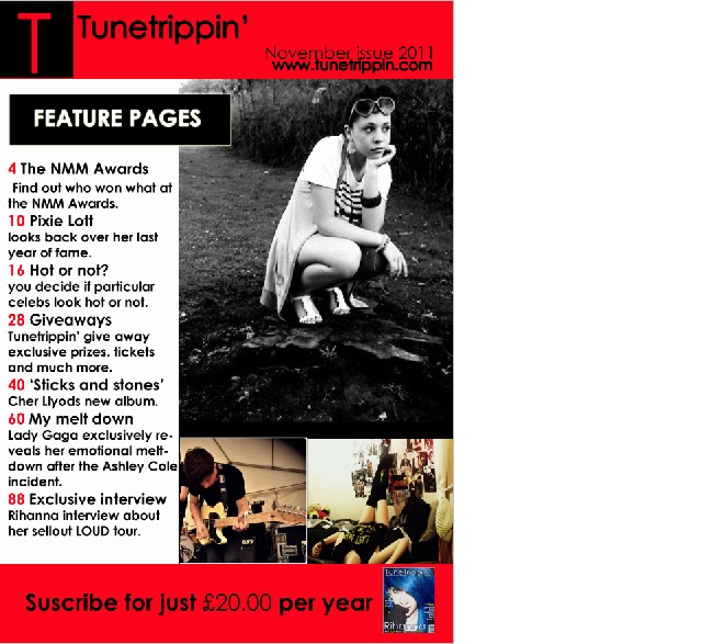
http://www.youtube.com/watch?v=jklgal1GEaU


I viewed various interviews with Rihanna on 'Youtube' to help give me a better understanding of a good and suitable interview that i could use the basics of for my double page spread which is an interview with Rihanna.

Friday, 2 December 2011

This is a first draft of my contents page.
This is a flatplan of my contents page.
This is some feedback i recieved from my peers abut my first draft of my front page before i modified it.
This is a first draft of my content page for my magazine.